

In Netskope R103, the UI for Advanced Analytics has a brand new look, and we think you’ll like it. That’s because based on the feedback from our user community, we’re making it easier for you to get the information you need, in a very personalized way. In some cases, we are adding new capabilities, such as the Persona profile so that you can quickly get information relevant to your job. In other areas, we’ve added quality of life improvements which makes many Advanced Analytics capabilities easier to find and use, such as favorite dashboards and counters to identify how many times a dashboard has been run.
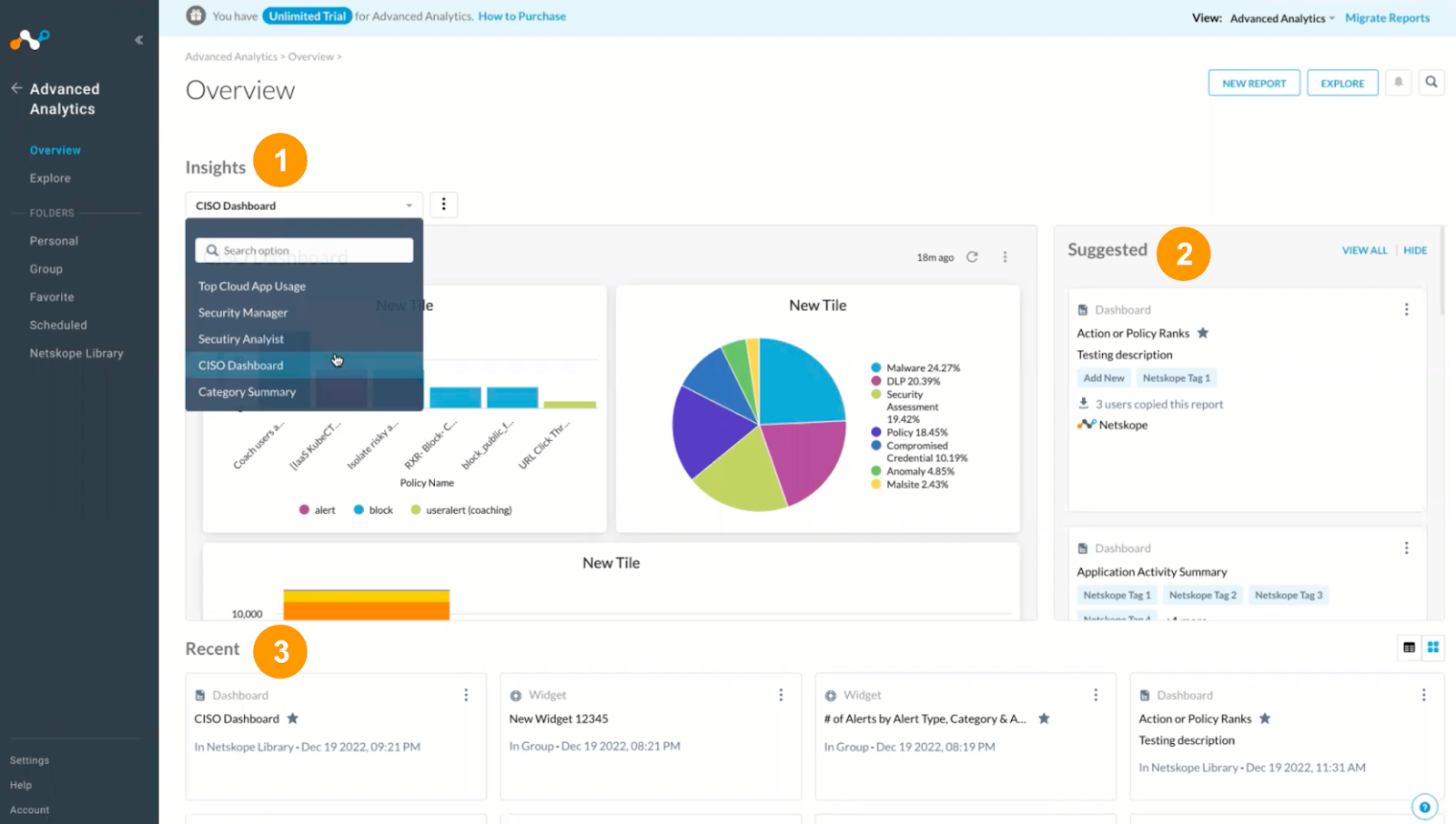
The most immediate change you’ll notice is that Advanced Analytics now has an Overview page. In the past, admins would go directly to an Advanced Analytics submenu item, such as Netskope Library, directly from the UI (don’t worry, this functionality is still here, if that’s what you’d like to do). What’s changed is that there is now an Overview page, which taps into what you want to do and what you want to see. This view aligns to personas that show information that’s relevant to your role in the organization. For example, management wants to understand the big picture and long term trends, whereas the admins need to see what’s happening right now. We’ve tagged the dashboards that fit the different personas so that they can be quickly accessed.
The tags are part of a broader set of dashboard organization features. For example, you can add tags to dashboards and widgets in your group and personal folders. You can also create, edit and assign custom tags that are specific to your organization (note that there are also pre-defined tags which can’t be edited or changed in Netskope Library). You can quickly find dashboards based on the tags, because the tags can be used to filter your browsing to zero in on what you want to see.
In addition to the tagging, there are changes to the library as well. The most immediate change is that dashboards are organized by category rather than alphabetical order. You’ll also see indicators that show how many times a dashboard has been used, so that you can get a feel for what is already popular, and also what else is available to discover.
This is just a small preview of the changes to the UI. Ready to learn more? Join Advanced Analytics Office Hours to see a demo and ask questions.


