Greetings and salutations!
I wanted to provide a quick update on some changes you’ll notice in our Community and why we’re doing them. We at Netskope, decided to rethink and restructure our Support page in the Community to make it easier for our customers to find the help they need. You may have also been noticing a lot of tweaks here and there to improve the user experience (quite notably, the change from a black hyperlink to orange).
Why did we update the community Support page? We thought about you, our customers, and info seekers. How can we reduce the friction between you and finding the answers you need? After many hours of design and analysis, we had a clearer picture of how to implement a Support page that would help link you to the right resources in an easily accessible way. We did away with the three links nested under Support on the old navigation bar. Now when you click on Support, you go to one main page with all the links to information you may need to find your answer.

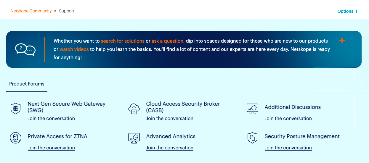
On the top of the page, you’ll see quick links to our Product Forums. If you have a question about a product, start with the Community first. Our SMEs and power users answer pretty quickly.
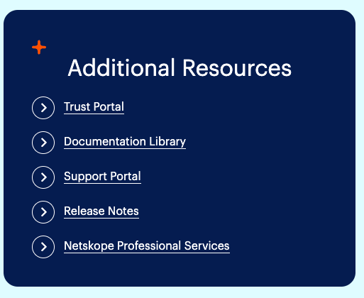
When you scroll down the page, you’ll discover links to the most utilized resources. The three links we removed from the navigation bar have been moved here.
We’ve also added a section of the latest Expert Videos posted in the Community, our Event Calendar, latest Blogs, and a list of our Top Solutions.
If you scroll down the page, you’ll have access to all the ways to connect with Customer Support.

We put a lot of time into our new Support page, but we know it may not have all the answers you seek. If you want to provide our team with your feedback, please reach out to our team at community@netskope.com or reply below – especially if you find any issues! We'll fix them as soon as possible.
I hope you enjoy our new Support page, so go ahead. Check it out!


