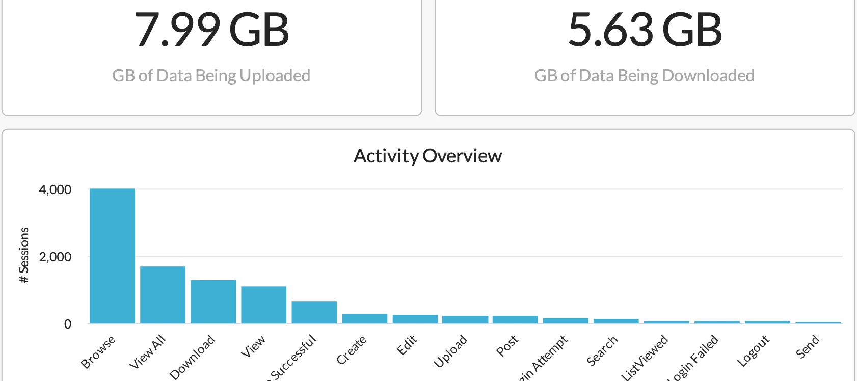
This dashboard gives a view of how data is moving in your organization. It allows you to filter for a specific application, user, or activity.
Using this dashboard, you can answer questions like:
- Who are the top users moving data and where are they moving the data to?
- Who is uploading or downloading data into specific applications, such as Box?
- What are the activities taking place in a specific application, such as Google Drive?
- Where is a specific user moving data from and to?
Also, the dashboard’s Sankey Chart allows you to understand how data is flowing from the user to the action. You can see the flow from user to from user to application to instance to activity to action. The best use for this widget is to filter for a specific user to see what data they are moving and to where.
The dashboard is attached below. Feel free to view it in your own environment and share any comments/feedback. Please also let us know if you want any additional fields/data to be added to the dashboard.


