
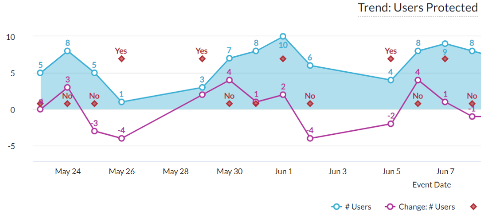

Let's start with this example first. Netskope created the visual below which shows the trend of # users protected in the last 30 days. The blue area represents # users for each day, and the purple line represents the change in # users from the previous day. However, Netskope also wants to know if there are any extremely high or low values in # users. In this case, we added a series of red diamonds that identify these extreme values, i.e. outliers.
An outlier is a data point that significantly differs from other observations. Identifying outliers will help you better understand and manage the objects. Here in Advanced Analytics, we can use the table calculation "Outlier (Y/N)?" to do this.
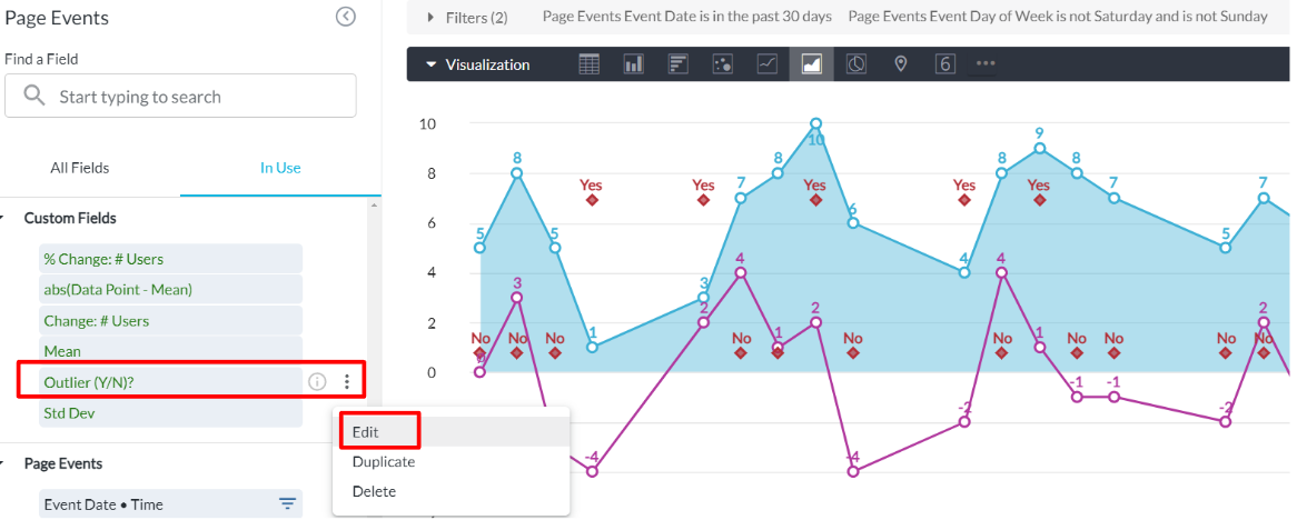
Within the edit mode of the visual, you can find the table calculation from the drop-down list (shown above). Click the 3-dot button and hit Edit, you will then see the full calculation logic.

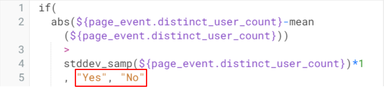
For this example, an outlier is defined as a data point which is 1 standard deviation away from the mean. So, there are 2 main parts in the calculation logic:
1): abs(${page_event.distinct_user_count}-mean(${page_event.distinct_user_count})) which returns the absolute value of the difference between the data point and the mean
2) stddev_samp(${page_event.distinct_user_count})*1 which returns 1 standard deviation
For a given data point, if the result of 1) is greater than 2), the data point is identified as an outlier (Yes). Otherwise, it is not an outlier (No).
Let's verify the results with 2 sample data points. On 2023-05-25, we have 5 in # users and 6 for mean. The difference is 6 - 5 = 1 which is less than the standard deviation. So, the data point is not an outlier.
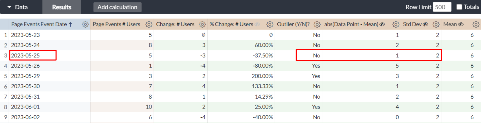

Similarly, on 2023-05-26, we have 1 in # users and 6 for mean. The difference is 6 - 1 = 5 which is greater than the standard deviation. So, the data point is an outlier.


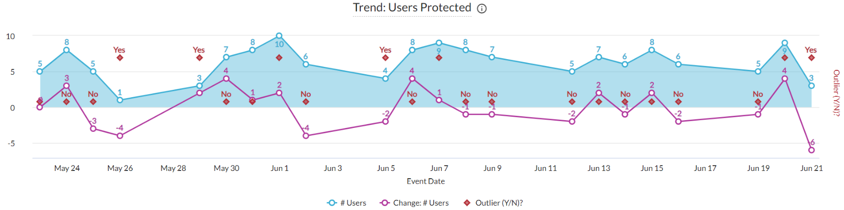
A sample dashboard is attached below. Please download and import it to your environment for more details. The calculation can be further customized based on your needs. For example, you can decide outliers by 3 standard deviations away from the mean. You can also apply a particular threshold here instead of the standard deviation.
Feel free to let us know if you have any questions or special requests. Happy to help!


