Netskope Community
07-08-2021 06:03 AM
Hey all,
So here's what the widget does:
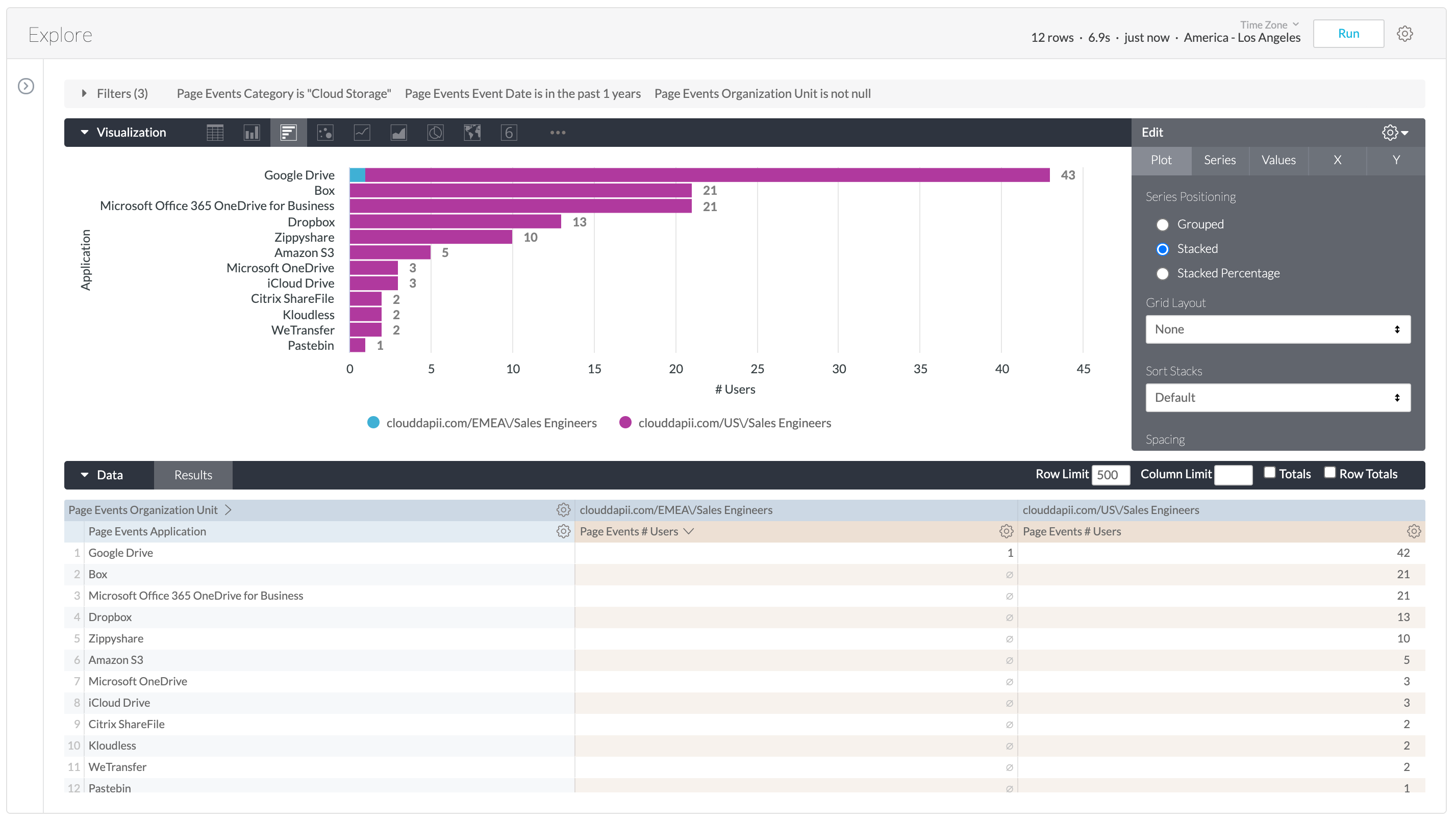
It looks to see how many users in each company division are using Cloud Storage apps.
The problem is there are many Cloud Storage apps, and the list just spans across too many columns.
(see the screen shot)
Is it possible to (within the same widget) break up the data into different rows, or would I have to use multiple widgets?
07-08-2021 12:32 PM
Great question @leftHanded! @btokuyoshi would you be able to provide some insight into breaking up the data into different rows within the same widget?
07-08-2021 12:37 PM
If we pivot on the OU/division field instead of the application, it would be easier to fit more apps in the visualization. With too many different measures in the visualization (#users, #events, etc.) it does get harder to read the data, so multiple reports like this for different fields is definitely a good idea.
The other option is to limit number of columns in your visualization (i.e. only show top apps used) .
Let me know if this helps!
In order to view this content, you will need to sign in to your account. Simply click the "Sign In" button below
Sign In