Ask the community

Map - Connected Points - Formatting

qyost
Contributor III

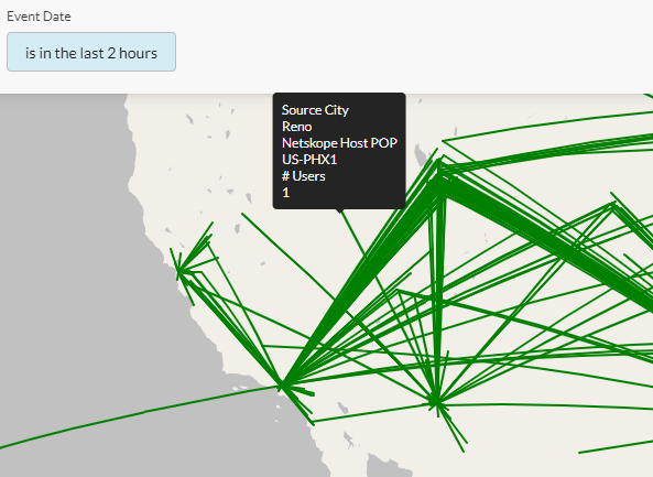
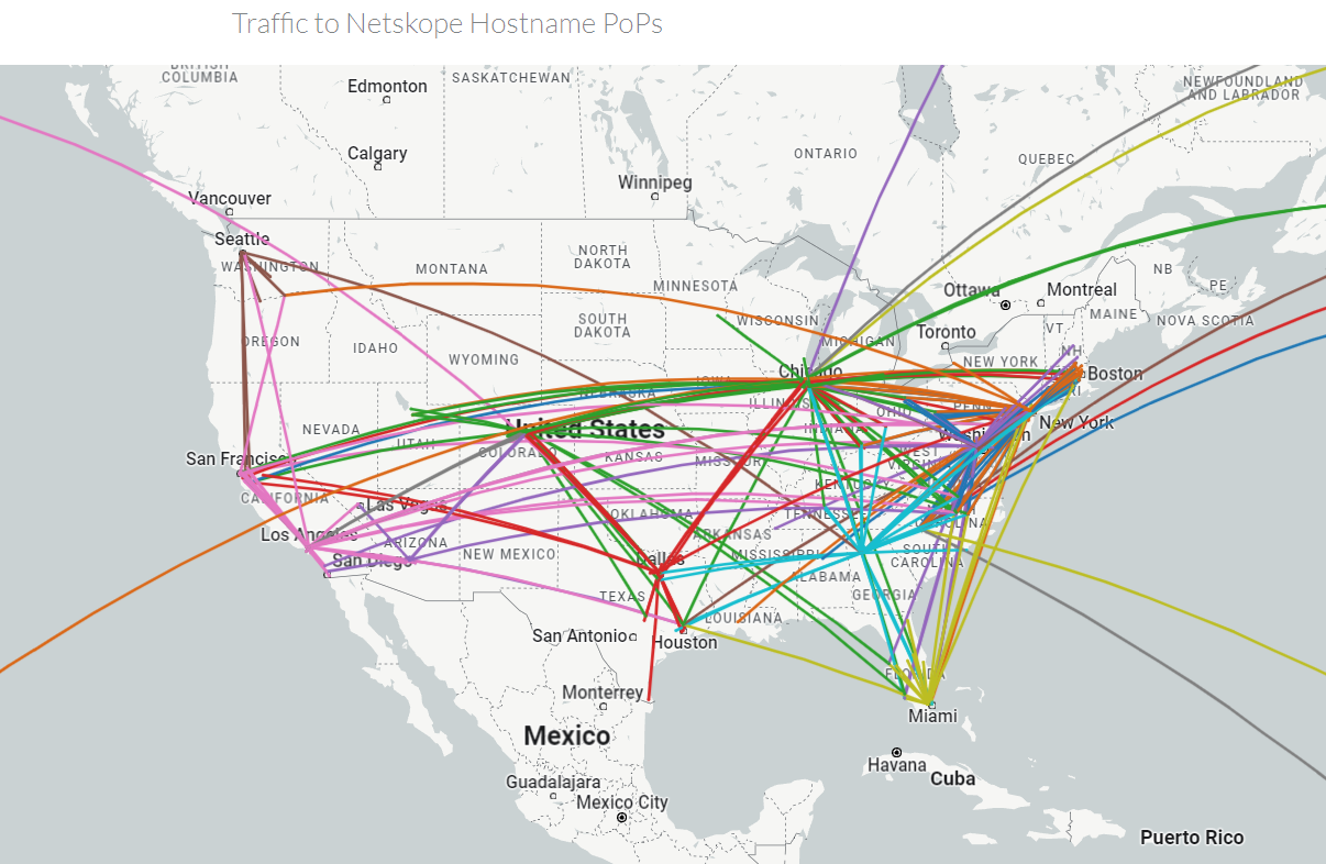
I've put together a quick map visualization, but I am not able to manipulate it in the manner I'd like to.

qyost_1-1686057110352.png


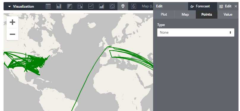
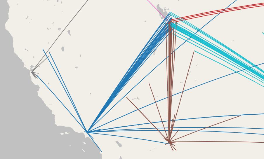
The editing options have a lot of control over how the points at the end of the line display, but I'm not really interested in the ends.   Instead, I'd like to change how the lines are displayed.  Am I overlooking something, or should I open an Enhancement Request to expose formatting controls for the lines themselves?

Specifically, I would like to color the line one end based on a string value associated with one of the points.

--
-Q.
2 Solutions
ematchey
Moderator
Moderator

One way to change the colors is to pivot one of the fields. So in this example you could pivot the Netskope HostPop Location. there are some limitations. One is that, You can only have 50 columns pivoted, and we have more hostpop locations than that. Try it and see if it works for you. 

View solution in original post

ematchey
Moderator
Moderator

Here is a sample of you can get. You can see the star/fireworks burst from/to each POP.  However, the lines are not perfect, they all connect to each other. There is a feature request in to make the line segments distinct. I've messaged you the widget directly. 

ematchey_0-1686098409328.png


View solution in original post

6 Replies 6
ematchey
Moderator
Moderator

hi @qyost 

Can you talk a little about the use case you are trying to implement? what are you trying to emphasize with the line data? That will better enable me to give you a solution and/or file an enhancement request. 


qyost
Contributor III

Just mapping out an alternative to the DEM active users, sourced from page logs.
Line is connecting Source Locations and Count of users per location to the receiving Netskope PoP Locations.  In addition to having the line, I would like to colour that line based on the PoP.

qyost_0-1686075812470.png


--
-Q.
ematchey
Moderator
Moderator

One way to change the colors is to pivot one of the fields. So in this example you could pivot the Netskope HostPop Location. there are some limitations. One is that, You can only have 50 columns pivoted, and we have more hostpop locations than that. Try it and see if it works for you. 

ematchey
Moderator
Moderator

Here is a sample of you can get. You can see the star/fireworks burst from/to each POP.  However, the lines are not perfect, they all connect to each other. There is a feature request in to make the line segments distinct. I've messaged you the widget directly. 

ematchey_0-1686098409328.png


qyost
Contributor III

Thanks!   That does get what I was looking for.

qyost_0-1686142383698.png


--
-Q.
qyost
Contributor III

Just in case anyone else wants to see the report I ended up with.

--
-Q.
Subscribe
Top Liked Authors

In order to view this content, you will need to sign in to your account. Simply click the "Sign In" button below

Sign In